This is a demonstration, not a client engagement. The population and outcomes below are synthetic. Every number in this write-up is the actual output of the analysis script — nothing was tuned after the fact to make the story cleaner.
The question
An organization wants a turnover risk score refreshed monthly — not a report on who already left, but a forward-looking flag on who's likely to leave in the next six months, with enough explanation attached that a manager can act on it rather than just worry about it. Today, the closest thing to a signal is the annual engagement survey: low scorers get a follow-up conversation, and that's the extent of the process.
Start with what's already there
Unlike the naive proxies in the other case studies, engagement score isn't a bad predictor. Tested alone against six-month turnover on a held-out sample, it does real work.
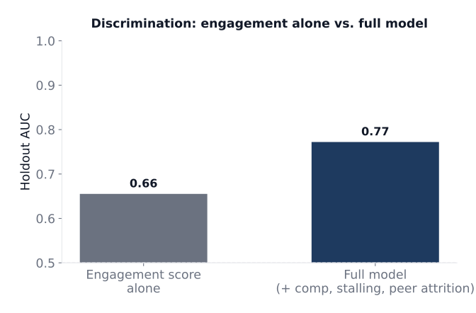
An AUC of 0.66 from a single survey item is a legitimately useful starting point — nowhere near the near-chance naive baselines in the other case studies. The mistake most organizations make isn't trusting engagement data; it's assuming that because they have a predictor, they've solved the problem.
Widening the lens
Three additional signals were added, each capturing something engagement scores don't:
- Pay competitiveness — current pay relative to the market band midpoint. Someone can love their job and still leave for a 20% raise.
- Promotion stalling — time since last promotion. Engagement surveys capture how someone feels right now, not whether they've quietly concluded their growth here has plateaued.
- Peer attrition — the share of an employee's immediate team that has left in the trailing six months. Turnover isn't purely an individual decision; coworkers' departures measurably raise the odds that the people around them leave too, a pattern documented in the turnover literature as "turnover contagion" (Felps et al., 2009).
None of these show up in an annual engagement survey. All three are already sitting in the HRIS and comp system.
The model
A logistic regression combining all four inputs lifts holdout discrimination from 0.66 to 0.77 — a substantial jump, not a marginal one.
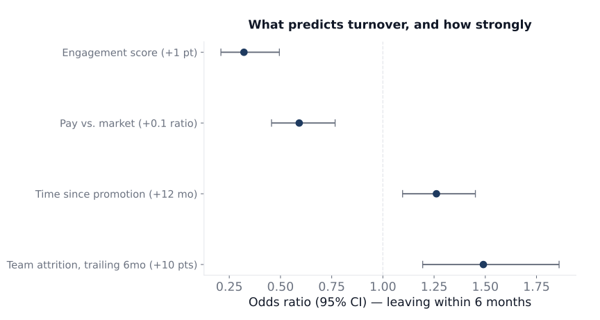
All four predictors clear conventional significance, and the direction of each is exactly what you'd expect: a one-point engagement gain multiplies the odds of leaving by roughly 0.32; being paid 10 points closer to market cuts the odds by roughly 41%; a year without a promotion raises the odds by roughly 26%; and every 10-point rise in trailing team attrition raises an individual's own odds by roughly 49%. That last one is the number worth sitting with — a team going through a wave of departures isn't just losing people, it's actively raising the flight risk of everyone who's left.
From score to action
Splitting the holdout population into ten risk deciles shows whether the model actually separates people who leave from people who stay — the practical test of a score that's going to drive real conversations.
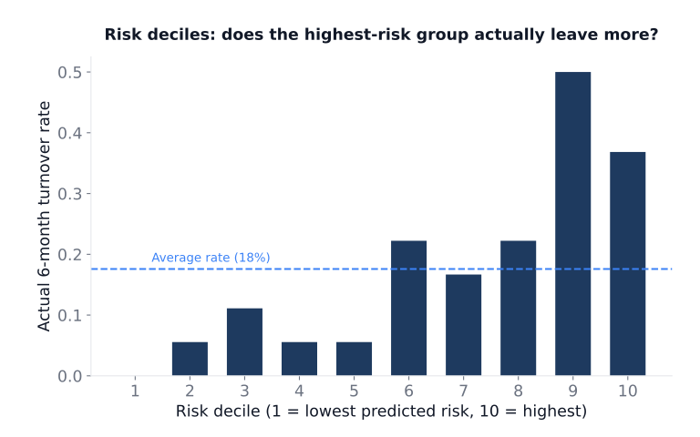
The trend runs the right direction — low deciles barely lose anyone, the top deciles lose far more than average — but it isn't a perfectly straight staircase. Decile 9 (50% actual turnover) came in higher than decile 10 (37%), the group the model rated as highest risk. With about 18 people per decile in this holdout, that's the kind of noise a small sample produces, not evidence the model is broken; it's exactly the sort of wobble that would need watching, not explaining away, if this were a live score.
The operational number: the top 20% of the workforce by predicted risk accounts for 50% of actual six-month departures. Flagging one in five people catches half of the people who are actually going to leave — a real, usable lift over flagging people at random, and small enough in headcount that it changes conversations with managers rather than dumping a spreadsheet on them.
What this demonstrates — and its limits
The synthetic numbers above illustrate a method, not a benchmark to expect elsewhere: don't stop at the one predictor you already have, add inputs that capture genuinely different mechanisms (comp, growth, social context) rather than restating the same signal, and report the score's practical performance (capture rate, decile behavior) rather than just a summary statistic.
A real engagement would go further than this demo: checking for adverse impact before any score reaches a manager, monitoring for model drift as compensation cycles and org structure shift underneath it, and validating the "peer attrition" signal carefully — it's a genuinely useful predictor and an easy one to build into a self-fulfilling narrative if it's presented to managers without care.
Want a risk score built for your own turnover drivers? The approach — start with what you already measure, add inputs that capture different mechanisms, validate against real outcomes — is the same one used in real engagements. Start a conversation or read more about workforce prediction models.